Good sign-up and login page design is the difference between a new user and a lost one. People don't visit your app to fill in a form. They want to book a viewing, check their balance or try your tool. The form is the door they have to get through first, and if that door sticks, many of them walk away.
This guide gives you 15 practical tips, split into sign-up tips, login tips and tips for both. Each one explains why it matters, how to do it and what good wording looks like. You'll also find a list of real mistakes that quietly stop people from getting in.
Sign-Up Page vs Login Page: What's the Difference?
The two pages look alike, but the people using them want different things. A sign-up page talks to someone new who isn't sure yet. A login page talks to someone who already trusts you and just wants to get in.
Sign-Up Page Design Tips
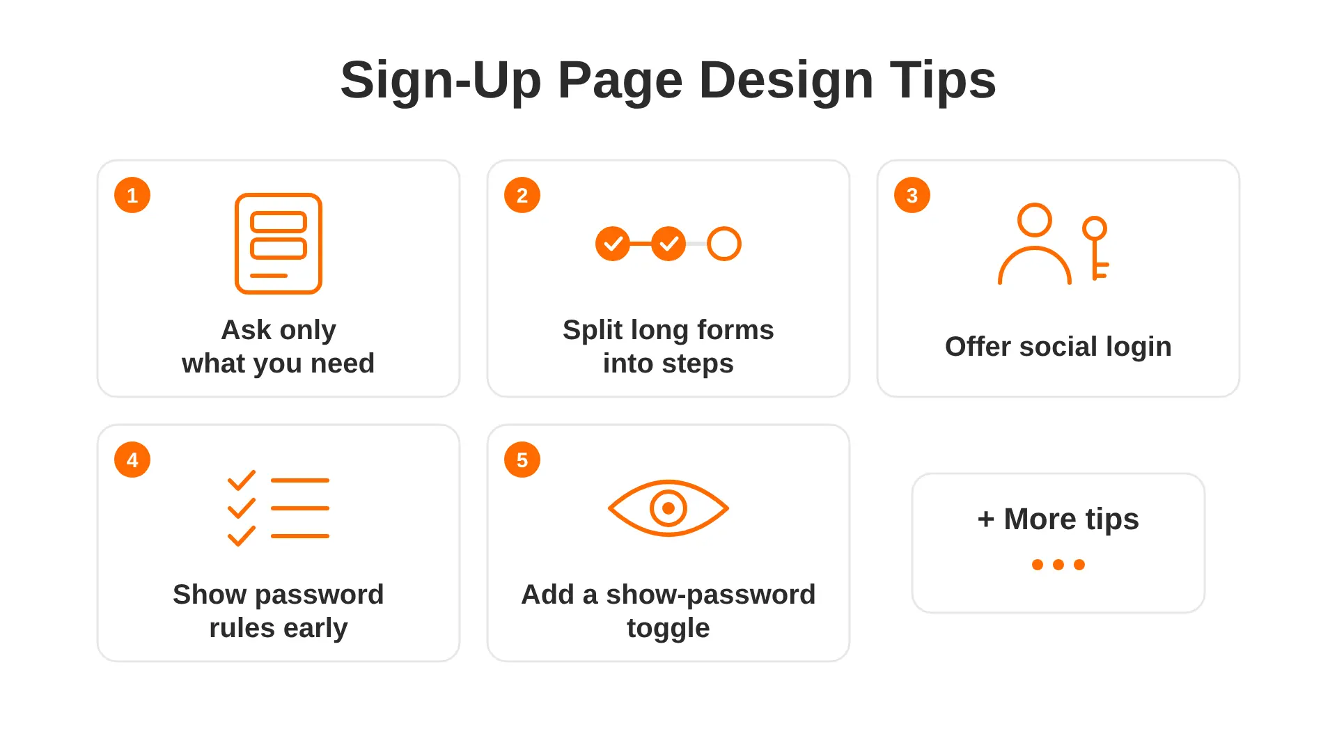
1. Ask Only for What You Need Right Now
Every field you add is one more reason to stop. Most products only need an email and a password to get someone started.
Why it matters: New users haven't seen your product yet. Asking for their phone number, company size and date of birth before they've seen any value feels like a lot to give up.
How to do it:
- List every field on your form and write next to it why you need it today
- Remove anything you can collect later, inside the product
- Make optional fields clearly say "(optional)", or drop them
Good example: Email, password, "Create account" button. That's it.
2. Split Longer Forms into Short Steps
Some products do need more details. A banking app needs identity checks. A property platform may need a postcode and budget. That's fine, but don't put it all on one screen.
How to do it:
- Group related questions together, such as "About you" then "Your business"
- Keep each step to three or four fields
- Show progress, such as "Step 2 of 3", so people know the end is close
- Let users go back without losing what they typed
- Save progress, so someone who closes the tab can carry on later
Short steps feel lighter, even with the same number of questions.
3. Tell People What They Get
A form on its own gives no reason to fill it in. A short line above it can change that.
How to do it:
- Add one headline that says the main benefit, not just "Sign up"
- Add two or three short points under it, such as "Free for 14 days" or "No card needed", but only if they're true
- Answer the common worry near the button, such as "We never share your email"
Good example: "Start planning your projects in minutes. Free to try, no card needed."
Avoid: A big "Register" title with nothing else on the page.
4. Offer Social Login and Single Sign-On
Many people would rather tap "Continue with Google" than make up another password. Social login, also called single sign-on (SSO), saves time and cuts forgotten passwords.
How to do it:
- Pick the options your users actually use. Google and Apple suit most consumer apps. Microsoft often suits work tools
- Use each provider's own button style, so people recognise it at once
- Place them above or below the email form with a clear "or" divider
- Keep the email option too, as some people don't want to link accounts
One thing to watch: if someone signed up with Google, show a hint like "Last time you used Google" on the login page. It saves a lot of confusion.
5. Show Password Rules Before People Type
Nobody likes typing a password, pressing the button and only then finding out it needs a symbol.
How to do it:
- Show the rules under the password field from the start
- Tick each rule off as the user types, with a tick and a colour change
- Keep rules simple. A longer password made of three random words is easier to remember and often stronger than a short one full of symbols
- Never block pasting into password fields. People who use password managers rely on it
Good example: "At least 10 characters ✓ Includes a number ✓"
6. Use a "Show Password" Toggle Instead of Typing It Twice
Asking people to type their password twice is meant to catch typos. A small eye icon that shows the password does the same job with half the effort.
Why it matters: On a phone, typos happen all the time. Typing a hidden password twice doubles the chance of getting it wrong.
How to do it:
- Add an eye icon or a "Show" text button inside the password field
- Make sure it can be reached with a keyboard and read by screen readers
- Keep it hidden by default, so nobody nearby sees it by accident
7. Check Each Field as the User Goes
Don't save all the errors for the end. If someone types "name@gmail" without ".com", tell them as soon as they move to the next field.
How to do it:
- Check a field when the user leaves it, not while they're still typing
- Put the message right under the field it belongs to
- Use words, an icon and a colour together, so the message doesn't rely on colour alone
- Show a green tick when a field is right, so people feel progress
Most modern tools handle this well. If your team is still choosing a stack, our guide to the best frontend frameworks for web apps explains which ones make form checks easier to build.
8. Keep Marketing Consent as an Unticked Box
If you want to send marketing emails, ask in a separate box and leave it unticked. In the UK, people need to choose to opt in themselves. The ICO explains this in its guidance on email marketing rules.
How to do it:
- Keep the terms and privacy notice as a short line with links, such as "By creating an account, you agree to our Terms and Privacy Policy"
- Put marketing consent in its own unticked box
- Write it in plain words: "Send me tips and news. You can stop any time."
Login Page Design Tips
9. Use Email, Not a Username
People forget usernames, especially for sites they visit once a month. Almost everyone remembers their email.
How to do it:
- Make the first field "Email address", not "Username or ID"
- Set the field so phones show the email keyboard with "@" and "."
- Let browsers and password managers fill it in automatically
- Ignore extra spaces and capital letters in the email, as they cause failed logins for no good reason
10. Offer Passkeys or a One-Time Code
Passwords cause most login trouble. People forget them, reuse them, and type them wrong. Many products now offer easier, safer ways in.
Options to consider:
- Passkeys: users log in with their fingerprint, face, or phone PIN. There's nothing to remember or leak
- One-time codes: a short code is sent by email or text, and the user types it in
- Magic links: a link in an email logs the user in with one tap
How to do it well:
- Keep a password option for people who prefer it
- Let the code field accept a paste, and support autofill from text messages
- Give codes a fair time limit, such as 10 minutes, and a clear "Send a new code" link
If you're building a new product, ask your web application development team to plan for passkeys from day one. Adding them later takes more work.
11. Warn When Caps Lock Is On
It sounds tiny, but Caps Lock causes plenty of failed logins. A small line under the password field, such as "Caps Lock is on", saves people from guessing what went wrong.
12. Write Clear, Kind Error Messages
"Error 401" or "Invalid input" tells the user nothing. Good error messages say what happened and what to do next.
How to do it:
- Use everyday words and no codes
- Never blame the user
- Keep the email they typed, so they only need to fix the password
- Link straight to the fix, such as a reset link
Good example: "That email or password doesn't match. Try again or reset your password."
Avoid: "Login failed." It's vague and gives the user nowhere to go.
This wording also stays safe because it doesn't tell strangers which emails have accounts. For apps that hold money or health data, add extra checks such as a code on a new device. Our fintech app development cost guide covers how this kind of security fits into the wider budget.
13. Make "Forgot Password" Easy to Find and Use
When someone forgets their password, they're already a bit annoyed. Don't make it worse.
How to do it:
- Put the "Forgot password?" link right under the password field, in readable text
- Fill in the email they already typed on the reset page
- Send the reset email fast, and say "Check your spam folder if it's not there in a few minutes"
- Make the reset link last long enough, such as one hour, so a slow email doesn't kill it
- Log the user straight in after they set a new password
14. Add a "Remember Me" Option
On their own phone or laptop, most people don't want to log in every time.
How to do it:
- Add a "Keep me logged in" box under the password field
- Leave it unticked on apps with private data, like banking or health, as people may use shared computers
- Explain how long it lasts if it's more than a few days, such as "for 30 days"
Tips for Both Pages
15. Make Switching Clear and Design for Every User
Make switching easy. People often land on the wrong page. Add a clear link under each form: "Already have an account? Log in" and "New here? Create an account". Avoid "Sign in" and "Sign up" side by side, as they differ by only two letters. "Log in" and "Create account" are much harder to mix up.
Design mobile-first. Most people will see your forms on a phone. So:
- Make fields and buttons big enough to tap with a thumb
- Show the right keyboard for each field
- Keep the main button visible without scrolling
- Use one clear button colour that stands out. Our guide to the colours people like most can help you choose one
Make it accessible. Every field needs a visible label that stays in place, not grey placeholder text that disappears. Text needs strong contrast, and the whole form should work with just a keyboard and a screen reader. The WCAG guidelines from W3C are the standard most UK teams work to. When we build forms for mobile apps, we check these points on real phones, not just on a laptop screen.
Common Sign-Up and Login Mistakes to Avoid
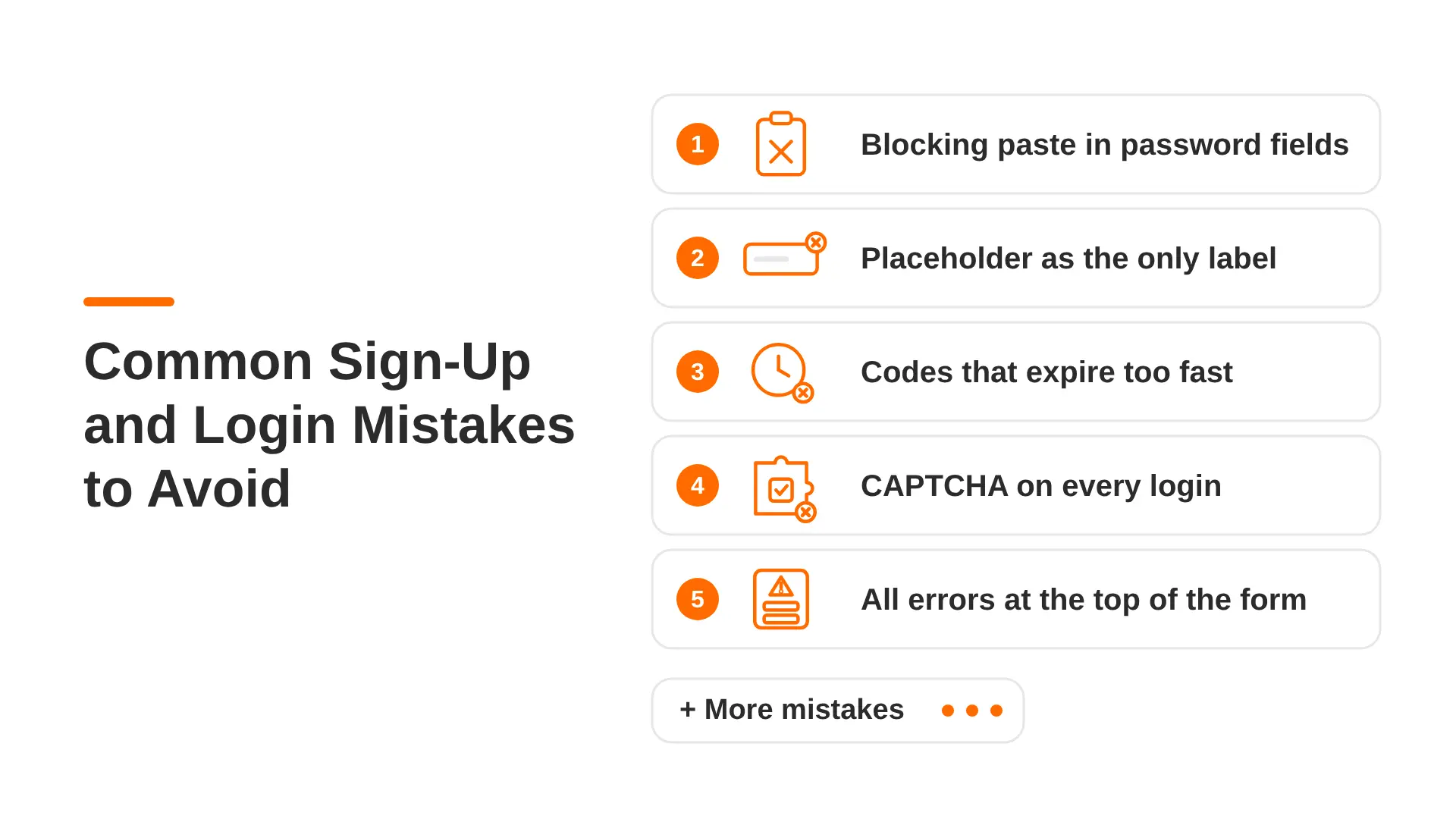
Some mistakes are easy to spot. These are the quieter ones that we often find when reviewing live products. Each one looks small but stops real people from getting in.
How to Test Your Sign-Up and Login Pages
You don't need expensive tools. Start with these checks:
- Use it on your own phone, with one hand, on mobile data.
- Watch three or four people sign up without helping them. Note where they stop or frown.
- Try every error on purpose. Wrong password, used email, expired code. Is each message clear?
- Look at your analytics to see which step loses the most people.
- Change one thing at a time, such as the button text, and compare the results.
It's far cheaper to fix these things before any code is written. A clickable mock-up built with one of these app prototyping tools lets you test the whole flow with real people in a day or two.
FAQs About Sign-Up and Login Page Design
What should a sign-up page include?
A good sign-up page needs an email field, a password field with a show option, a clear "Create account" button, and a link to log in instead. You can add social login buttons, a short line about the benefit, and an unticked box for marketing emails. Leave everything else for later.
What is the difference between sign in and log in?
There's no real difference. Both mean getting into an account you already have. "Log in" is very common in the UK. Pick one and use it everywhere, and make sure it looks clearly different from your sign-up button.
How many fields should a sign-up form have?
As few as possible. For most products, two fields (email and password) are enough to start. If you need more, split them into short steps of three or four fields each.
Should you ask users to confirm their password?
Usually not. A "show password" toggle lets users check what they typed with less effort. Typing a hidden password twice adds work, especially on a phone.
Are passkeys better than passwords?
For most users, yes. Passkeys use a fingerprint, face or phone PIN, so there's nothing to forget and nothing for scammers to steal. It's still wise to keep a password or email code option for people who aren't ready to switch.
How do I make a login page work well on mobile?
Use big fields and buttons, the right keyboard for each field and support for autofill. Keep the main button in view without scrolling. Offering passkeys or Apple and Google login also helps, because users can get in with one tap.
Final Thoughts
The best sign-up and login pages are the ones nobody remembers. People get through them without thinking and land where they wanted to be. Ask for less, explain more, help people fix mistakes, and make every screen work on a phone. You don't have to do all 15 tips at once. Start with the ones that fix your biggest drop-off and build from there.
If you'd like expert eyes on your sign-up flow, our UI/UX design agency in the UK can review your screens and help you shape a user experience that feels easy from the very first click.