Good colour combinations can make a website feel clear, trustworthy, and easy to use. Bad ones can make the same site feel cheap or confusing, even when everything else is right. The tricky part is that "good" depends on what you're building and who it's for.
This guide gives you 20 colour combinations with hex codes you can copy, grouped by the colour wheel rule behind them. For each one, you'll see how it feels and what kind of project it suits. You'll also learn how to pick your own mix and how to make sure your colours are easy to read.
What Makes Good Colour Combinations?
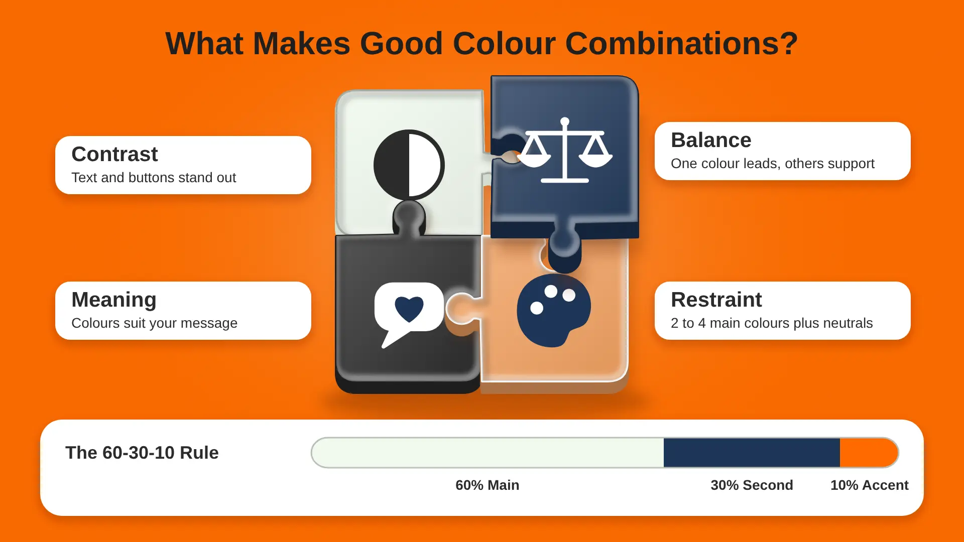
A strong colour combination isn't just "colours that look nice". It does a job. Most combinations that work share four things:
- Contrast: there's enough difference between colours, so text is readable and buttons stand out.
- Balance: one colour leads, and the others support it. Nothing fights for attention.
- Meaning: the colours suit the message. A bank wants calm and trust. A kids' app wants fun.
- Restraint: most good palettes use two to four main colours, plus neutrals like white, grey or black.
A handy rule for balance is 60-30-10. Use your main colour for about 60% of the design, a second colour for about 30%, and an accent for the last 10%. On a website, the 60% is often a light background, the 30% is your brand colour, and the 10% is saved for buttons and highlights.
Colour Wheel Basics
The colour wheel is a circle of colours arranged by hue. Most proven colour combinations come from a few simple rules on that wheel:
- Complementary: two colours opposite each other, like blue and orange. Strong contrast and lots of energy.
- Analogous: three colours next to each other, like blue, teal and green. Calm and natural.
- Triadic: three colours spaced evenly, like red, yellow and blue. Bright but balanced. Our guide to triadic colours explains this one in more depth.
- Monochromatic: different shades and tints of one colour. Clean and simple.
- Split complementary: one colour plus the two colours either side of its opposite. Bold, but easier to balance than complementary.
It also helps to know warm and cool colours. Reds, oranges and yellows are warm. They feel lively and seem to come forward on a page. Blues, greens and purples are cool. They feel calmer and seem to sit back. Many strong combinations mix one warm colour with one cool colour, like navy and orange, because the two balance each other out.
You don't need to remember angles. Free tools like Adobe Color, Coolors and the colour pickers in Figma will apply these rules for you.
20 Colour Combinations That Work
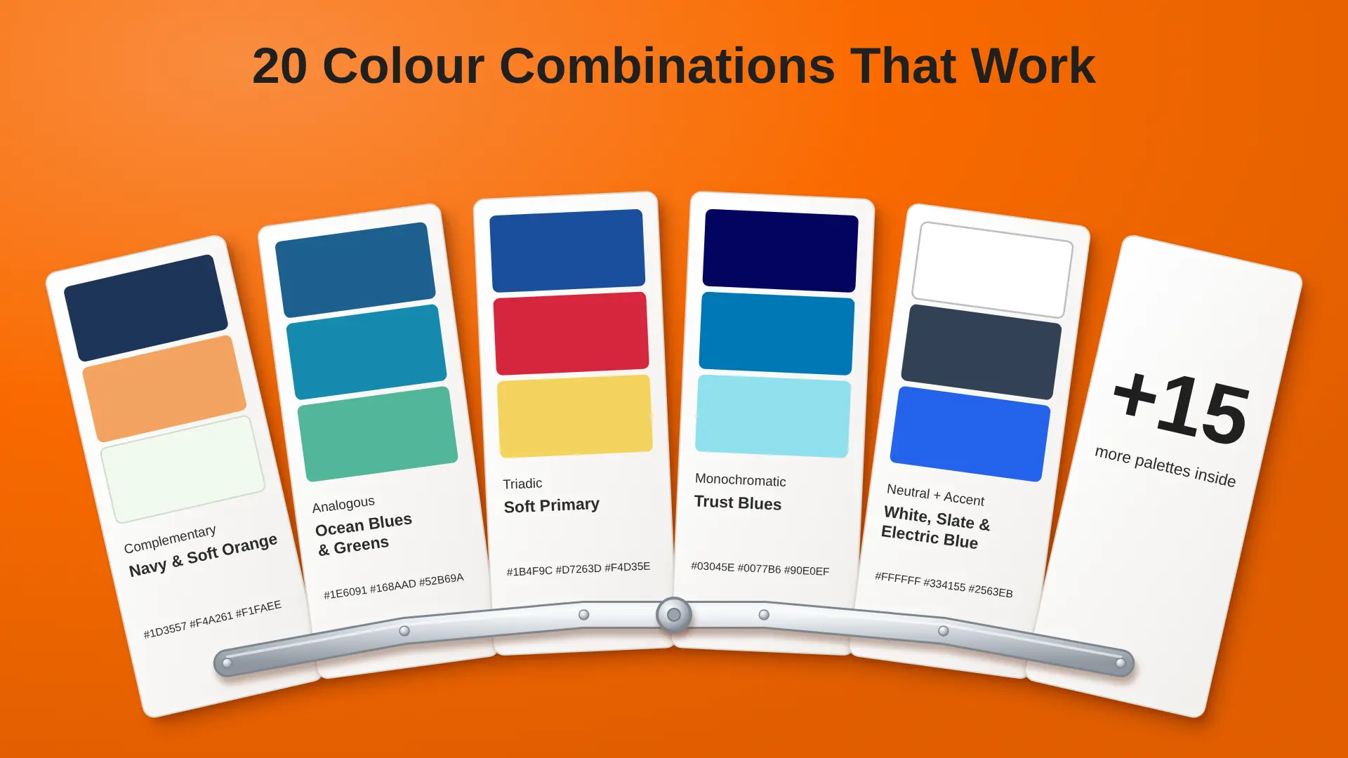
Each palette below includes hex codes, the mood it gives off and the projects it suits best. Feel free to tweak the shades to fit your brand.
Complementary Colour Combinations
Complementary pairs create the most contrast. They're great for drawing attention, but one colour should always lead.
1. Navy and Soft Orange
- Hex codes: #1D3557, #F4A261, #F1FAEE
- Feels: trusted, warm, and friendly
- Best for: service businesses, SaaS landing pages and agencies
- Tip: use navy for headings and backgrounds, and save orange for buttons
2. Deep Purple and Golden Yellow
- Hex codes: #5E3B8C, #F6C445, #FFFFFF
- Feels: creative, confident, and a little premium
- Best for: events, online courses and creative studios
- Tip: keep yellow for small highlights, as large yellow areas can tire the eyes
3. Teal and Coral
- Hex codes: #2A9D8F, #FF6F59, #FDFCF8
- Feels: fresh, upbeat and approachable
- Best for: health and wellness apps, travel brands and booking sites
- Tip: coral makes a friendly button colour, but use dark text on it
4. Forest Green and Blush Pink
- Hex codes: #2D6A4F, #F7A1C4, #FFF8F5
- Feels: natural, modern and gentle
- Best for: beauty brands, florists and lifestyle shops
- Tip: let the soft pink fill backgrounds and use green for headings
Analogous Colour Combinations
Analogous palettes sit side by side on the wheel. They feel smooth and calm, so you'll often need a neutral or one darker shade for contrast.
5. Ocean Blues and Greens
- Hex codes: #1E6091, #168AAD, #52B69A
- Feels: calm, clean and reliable
- Best for: fintech, healthcare and B2B software
- Tip: use the darkest blue for text and the light green for success messages
6. Warm Sunset
- Hex codes: #E76F51, #F4A261, #E9C46A
- Feels: warm, welcoming and cosy
- Best for: restaurants, food delivery and hospitality
- Tip: pair with a dark brown or charcoal for text, as these colours are too light for small writing
7. Violet to Electric Blue
- Hex codes: #5A189A, #7B2CBF, #4361EE
- Feels: techy, bold and forward-looking
- Best for: AI tools, SaaS products and gaming
- Tip: works well on dark mode screens with near-black backgrounds
8. Olive and Sage
- Hex codes: #283618, #606C38, #A3B18A
- Feels: earthy, grounded and honest
- Best for: sustainable brands, outdoor gear and garden centres
- Tip: add a cream background so the greens don't feel too heavy
Triadic Colour Combinations
Triadic palettes are lively. Let one colour lead and use the other two in small amounts.
9. Soft Primary
- Hex codes: #1B4F9C, #D7263D, #F4D35E
- Feels: cheerful, bold and simple
- Best for: children's brands, learning apps and toy shops
- Tip: add plenty of white space so the page doesn't feel crowded
10. Teal, Magenta and Olive
- Hex codes: #2487A8, #A82487, #87A824
- Feels: creative and unexpected
- Best for: media brands, podcasts and design studios
- Tip: pick one of the three as your lead colour and keep the others for tags and icons
11. Muted Orange, Sage and Lavender
- Hex codes: #E07A5F, #8CB369, #8E7DBE
- Feels: soft, playful and relaxed
- Best for: cafés, stationery brands and family services
- Tip: these soft shades suit illustrations and packaging really well
12. Blue-Green, Berry and Amber
- Hex codes: #2A9D8F, #B5179E, #F6AE2D
- Feels: rich and eye-catching
- Best for: fashion, music and entertainment
Monochromatic Colour Combinations
Monochromatic palettes use one colour in different strengths. They're the easiest to get right and always look tidy.
13. Trust Blues
- Hex codes: #03045E, #0077B6, #90E0EF
- Feels: safe, professional and steady
- Best for: banks, insurance and corporate sites
- Tip: add a warm accent, like orange, if you want buttons to pop
14. Fresh Greens
- Hex codes: #1B4332, #40916C, #B7E4C7
- Feels: healthy, calm and growing
- Best for: health brands, eco products and charities
- Tip: the pale green works nicely as a section background behind dark green text
15. Charcoal Greys
- Hex codes: #212529, #6C757D, #E9ECEF
- Feels: minimal, modern and serious
- Best for: portfolios, tech products and architecture firms
- Tip: add one bright accent colour for buttons so the page doesn't feel flat
16. Terracotta Tones
- Hex codes: #9C4A2F, #D67B5C, #F2D0C4
- Feels: warm, crafted and homely
- Best for: interior brands, handmade goods and coffee shops
- Tip: pair with a deep brown for text to keep the warm feel
Neutral and Accent Colour Combinations
These palettes are mostly neutral, with one bright colour doing the talking. They're a safe and stylish choice for most business websites.
17. Off-White, Charcoal and Bright Orange
- Hex codes: #FAFAF7, #2B2B2B, #FF6A00
- Feels: confident, clean and energetic
- Best for: startups, agencies and product launches
18. Cream, Black and Red
- Hex codes: #F5F0E6, #111111, #C1121F
- Feels: classic, editorial and bold
- Best for: fashion, magazines and restaurants
- Tip: use red sparingly, for prices, offers or one key button
19. White, Slate and Electric Blue
- Hex codes: #FFFFFF, #334155, #2563EB
- Feels: clear, focused and techy
- Best for: SaaS apps and dashboards. Our guide to SaaS dashboard design shows how a single accent colour keeps busy screens easy to read.
20. Beige, Forest Green and Gold
- Hex codes: #EDE6DB, #1F3D2B, #C9A227
- Feels: luxurious, calm and established
- Best for: property brands, hotels and premium services
- Tip: use gold for thin lines and icons, not for text, as it's hard to read on light backgrounds
What Different Colours Say
Colours carry meaning, and that meaning shapes how people feel about your brand. These links are common in UK and Western design, though they can change across cultures.
Use these as a guide, not a rule. The way you combine colours often matters more than any single colour on its own.
Colour Combinations by Project Type
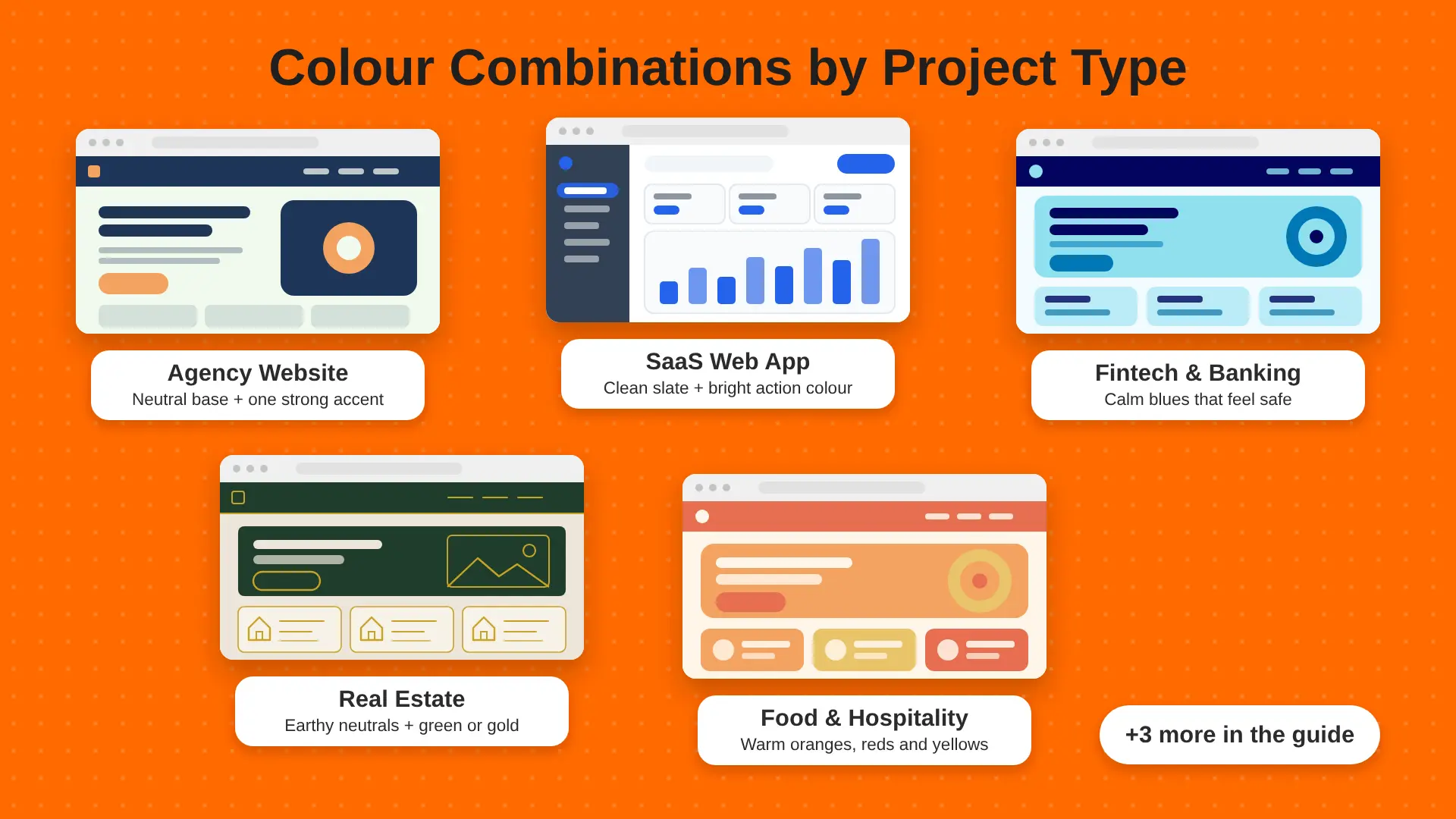
Not sure where to start? This table matches common projects with colour combinations that tend to suit them.
These are starting points, not fixed rules. A fintech brand can use orange, and a kids' brand can use navy. What matters is that the colours fit your audience and your message.
If you want to see which colours people tend to like most before you choose, our guide to the most popular colours is a useful read.
How to Use a Colour Combination on a Website
A palette only becomes useful once each colour has a clear role. Here's how palette 1 (navy, soft orange and off-white) could be set up on a real website. We checked each text pairing against the 4.5:1 contrast target.
White text on the orange button scores only about 2.1:1, which fails. Small choices like text colour on buttons make a big difference to how easy your site is to use.
How to Choose the Right Colour Combination
Here's the simple process we use in our web design and development work for UK businesses when picking colours for a new website or app.
- Start with your brand. If you already have a logo colour, build around it. If not, pick one colour that matches how you want people to feel.
- Pick a colour wheel rule. Want bold contrast? Try complementary. Want calm? Try analogous or monochromatic. Want playful? Try triadic.
- Add neutrals. Choose a light background colour and a dark text colour. These will cover most of your screen.
- Give each colour a job. For example: blue for links, orange for buttons, green for success messages. Write these rules down.
- Test it on real screens. Mock up a homepage and a form, then look at them on a phone and a laptop. Colours often look different in context than in a palette tool.
Design tools make this much easier. Our comparison of Figma and Adobe XD covers which one is better for building and sharing colour styles with your team.
Colour Combinations and Accessibility
A palette can look lovely and still be hard to read. Many people worldwide have some form of colour blindness or low vision, so contrast really matters.
The WCAG contrast guidance from W3C asks for a contrast ratio of at least 4.5:1 for normal text and 3:1 for large text. Here's how that plays out with palette 1:
- Soft orange #F4A261 text on white scores only about 2.1:1. It fails.
- The same orange on navy #1D3557 scores about 6.0:1. It passes.
A few simple habits help:
- Use your darkest colours for text and your brightest colours for shapes, icons, and backgrounds.
- Don't rely on colour alone. Add icons or words to error and success messages.
- Avoid red and green as the only way to show "good" and "bad", as they're the hardest pair for colour-blind users.
- Check every text and background pair with a free contrast checker before launch.
Forms are where poor contrast causes the most trouble. Our tips on sign-up and login page design cover how to make labels, buttons and error messages easy to read.
Common Colour Combination Mistakes
FAQs About Colour Combinations
What colours go well together?
Colours that sit opposite each other on the colour wheel, like blue and orange, go well together for contrast. Colours next to each other, like blue and green, go well together for calm. Neutrals such as white, grey, black and cream pair well with almost any colour.
How many colours should a website have?
Most websites work best with two to four main colours plus neutrals. A common setup is one brand colour, one accent colour for buttons, and a light and dark neutral for backgrounds and text. More than that often looks busy and confuses users.
What is the 60-30-10 colour rule?
The 60-30-10 rule splits your colours by amount. About 60% of the design uses a main colour, 30% uses a second colour, and 10% uses an accent. It helps one colour lead while keeping the design balanced and easy on the eye.
What are the best colour combinations for a business website?
Navy with orange, white with slate and blue, and charcoal with one bright accent are safe, strong choices. They look professional, keep text readable, and make buttons easy to spot. The best choice still depends on your brand and audience.
What is the best colour combination for text?
Dark text on a light background is the easiest to read. Near-black on white or cream works best for long text. If you use coloured text, check that it meets a contrast ratio of at least 4.5:1 against its background.
Final Thoughts
Great colour combinations follow a few simple rules: pick a lead colour, choose a colour wheel rule that fits your mood, lean on neutrals, and give each colour a clear job. Then test everything on real screens and check your contrast. Start with one of the 20 palettes above, adjust it to your brand, and you'll have a solid base for your website or app.
If you'd like help turning your colours into a full brand and website, our UI/UX design agency in the UK can build a colour system that looks good and works well. We also offer brand design to help you set up colours, logo, and guidelines from day one.