Triadic Colours Explained: How to Build a Balanced Colour Scheme
Triadic colours are three colours spaced evenly around the colour wheel. Picture a triangle sitting inside the wheel, with each point landing on a different colour. That simple shape gives you a palette that feels bright and lively but still balanced.
Lots of designers love triadic schemes. Lots also get them wrong, because three strong colours can fight each other fast. This guide shows you what triadic colours are, gives you real examples with hex codes, and walks you through how to use them on websites, apps and brands without making a mess.
What Are Triadic Colours?
A triadic colour scheme uses three colours equally spaced on the colour wheel. On a 12-part wheel, you count four steps between each colour. If you joined them with lines, you'd get a triangle with equal sides.
The best-known triad is red, yellow and blue. These are the primary colours most of us learnt at school.
Because the three colours are so far apart, they contrast well. But because they're evenly spread, no single colour takes over by accident. That's the balance people like.
Quick facts:
- Number of colours: three, plus any neutrals you add
- Shape on the wheel: an equal-sided triangle
- Feel: bright, playful and energetic
- Hardest part: stopping the three colours from competing
Which Colour Wheel Should You Use?
This trips people up. There are two common colour wheels:
- The painter's wheel (RYB): red, yellow and blue are the main colours. Artists and many design guides use this one.
- The screen wheel (RGB): red, green and blue are the main colours. Digital tools like Figma and most online pickers use this one.
The same "start" colour gives you different triads on each wheel. On the painter's wheel, red pairs with yellow and blue. On a screen wheel, red pairs with green and blue. Neither is wrong. Just stick to one wheel for the whole project.
Triadic Colour Examples
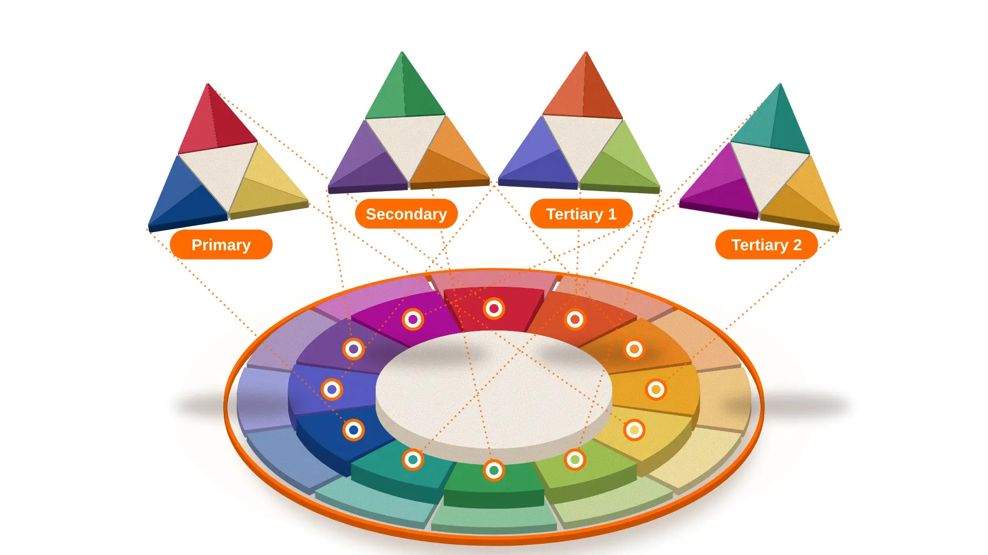
Here are the main triads on the painter's wheel, with hex codes you can copy straight into your design tool. We've picked slightly softened versions, because pure colours are often too harsh on a screen.
Primary Triad
Red, yellow and blue are the loudest triad. You'll see them in children's brands, toys and games, because they feel cheerful and simple. Piet Mondrian built many of his famous paintings around these three colours, set against white and black lines.
Use this triad with care on a business website. It works best when one colour leads and the other two only show up in small doses.
Secondary Triad
Orange, green and purple sit between the primary colours. They feel a bit softer and more unusual, so they suit creative brands, events and food products. This triad can look busy, so muted versions, like sage green and dusty purple, often work better.
Tertiary Triads
Tertiary colours are mixes of a primary and a secondary colour, such as red-orange or blue-green. There are two tertiary triads:
- Red-orange, yellow-green and blue-violet: a modern mix that suits tech and lifestyle brands
- Yellow-orange, blue-green and red-violet: a rich mix that works well for fashion, beauty and media
These feel less obvious than the primary triad, which makes them a good pick if you want to stand out without looking childish.
A Screen-Wheel Triad Example
If you work in a digital tool, you might start from a brand blue and let the tool find the other two. Starting from blue #2487A8 on a screen wheel gives you magenta #A82487 and olive green #87A824. These three look strong together, and they're a good reminder that triads don't have to mean red, yellow and blue.
How to Use a Triadic Colour Scheme: Step by Step
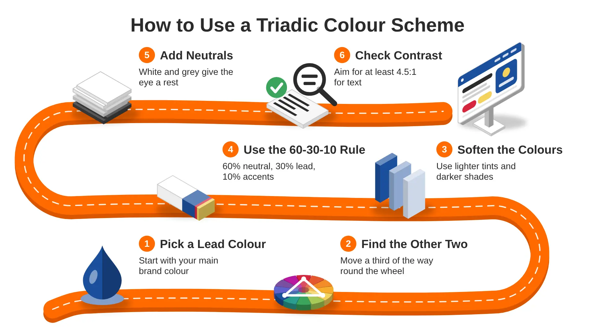
A triad gives you three colours. The skill is in how much of each you use. Here's a simple process that works for websites, apps and brand kits.
1. Pick One Lead Colour
Start with the colour that matters most. This is often your brand colour or the colour that fits your message best.
- A finance app might start with a calm blue
- A food brand might start with a warm orange
- A kids' learning site might start with a bright yellow
Everything else is built around this choice.
2. Find the Other Two on the Colour Wheel
Move a third of the way around the wheel from your lead colour, then another third. You don't need to do this by eye. The Adobe Color wheel tool has a "Triad" option that finds the other two colours for you. Figma plugins and most palette generators do the same.
3. Soften the Colours
Pure, full-strength colours side by side can feel loud and tiring. Try these tweaks:
- Lower the saturation (how strong a colour is) on one or two colours
- Make one colour darker and one lighter
- Keep the lead colour strongest and tone down the others
You still have a triad. It just feels calmer and more grown-up.
Tints and shades help too. A tint is a colour mixed with white, and a shade is a colour mixed with black. One lead blue can give you a pale blue for backgrounds, a mid blue for buttons and a deep navy for headings. That gives you plenty of range without adding new colours.
4. Use the 60-30-10 Rule
The 60-30-10 rule is a simple way to share out your colours:
- 60% for the main colour, often a neutral like white or off-white for websites
- 30% for your lead triadic colour
- 10% for the other two triadic colours, used as accents
On a website, that might mean a white background, blue headers and panels, and red and yellow only on buttons, icons and small highlights.
5. Add Neutrals
Neutrals give the eye somewhere to rest. White, cream, light grey, charcoal and near-black all work well with triads. Most good triadic designs are mostly neutral, with the three colours used on purpose.
6. Check Contrast and Accessibility
Bright colours don't always mean readable colours. Text needs enough contrast against its background so everyone can read it, including people with low vision.
The WCAG contrast guidance from W3C asks for a contrast ratio of at least 4.5:1 for normal text. Pure red #FF0000 on white scores about 4.0:1, so it fails for small text. Bright yellow on white is almost unreadable. Use your darker colours for text, and keep bright ones for shapes and backgrounds.
Example: A Triadic Palette for a Website
Here's how the primary triad from earlier could work on a real web page. We checked each text pairing against the 4.5:1 contrast target.
A few things to notice:
- The blue does most of the colour work, so the page feels calm rather than loud.
- Red only appears where you want people to click, so buttons are easy to spot.
- Yellow is great for drawing the eye, but it needs dark text on top of it.
You can swap in any triad and follow the same pattern. Just run each text and background pair through a contrast checker before you hand the design to developers.
Triadic Colours in Real Designs
You'll find triadic schemes all around you once you start looking.
- Logos: Burger King's logo, used from 1999 until its 2021 rebrand, mixed red, yellow and blue. Tide's packaging uses orange, yellow and blue in a similar spirit.
- Art: Mondrian's grid paintings are one of the best-known uses of the primary triad.
- Kids' products: toys, learning apps and play areas often use bright primary triads because they feel friendly and simple.
Real-world triads are rarely perfect triangles. Designers bend the rules a little so the colours suit the brand.
Using Triads on Websites and Apps
For digital products, triads work best as an accent system:
- Use one triadic colour for main buttons and links
- Use the second for success messages, tags or charts
- Use the third for small highlights, like badges or icons
This keeps the screen clean and gives each colour a clear job. In dashboards, triads are handy for charts, because three colours that sit far apart are easy to tell apart. Our guide to SaaS dashboard design shows how colour helps people read data quickly.
If you're still choosing a base colour, our look at the colours people like most is a good starting point.
Using Triads in Branding
A triad can also shape a whole brand kit. A simple way to set it up:
- Primary brand colour: your lead triadic colour, used in the logo and main headings
- Secondary colours: the other two, used in illustrations, social posts and packaging
- Neutrals: a light and a dark neutral for text and backgrounds
- Rules: write down which colour goes where, so your team uses them the same way every time
That last point matters more than people think. Without clear rules, triadic brands drift and start to look messy across different channels. If you're building a brand from scratch, our brand design service can help you set up colours, logo and guidelines together.
Triadic vs Other Colour Schemes
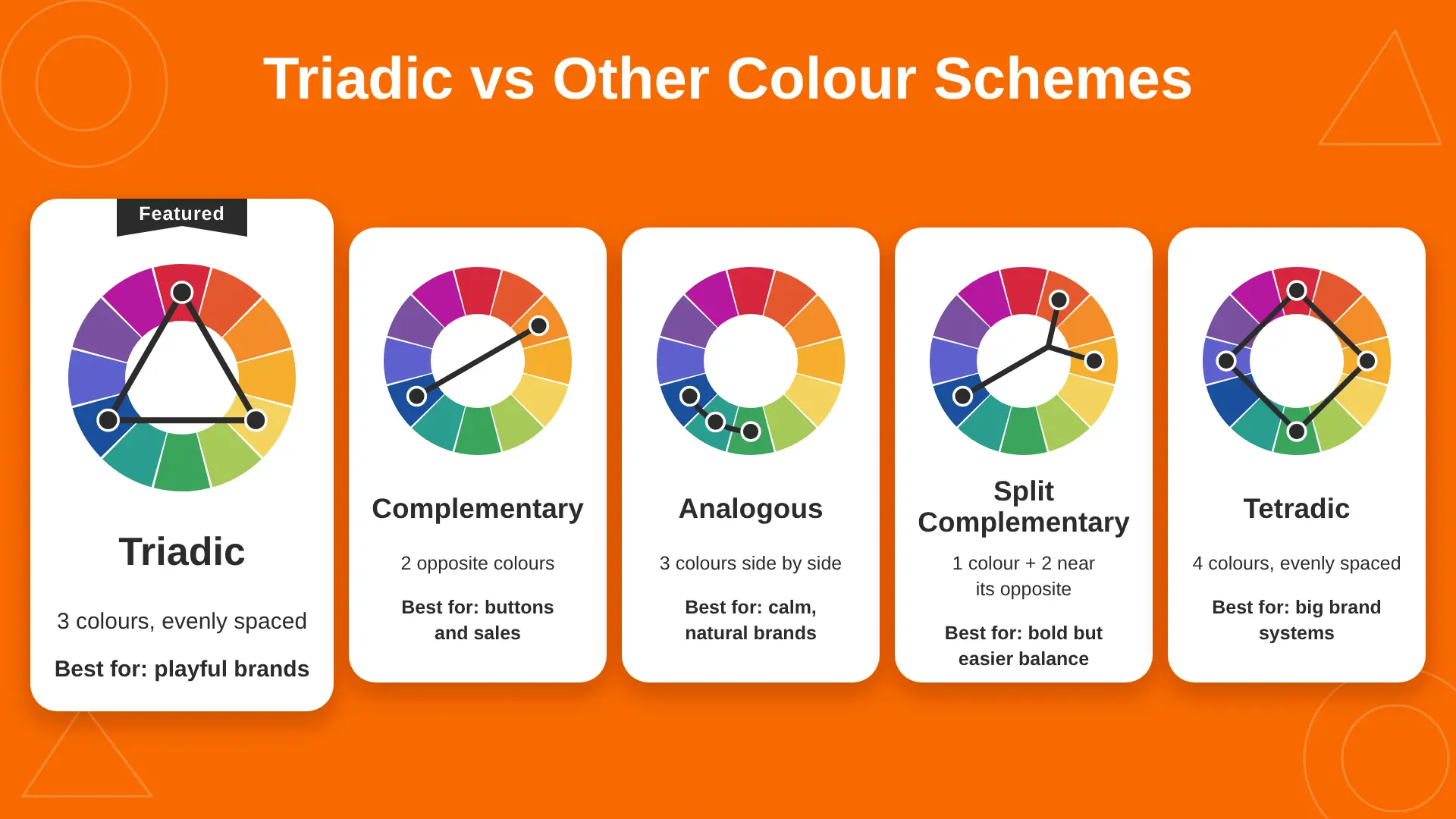
Triadic is one of several colour wheel rules. Here's how it compares.
If triadic feels too busy for your project, split complementary is often the easiest swap. It keeps strong contrast but is a little gentler.
Common Triadic Colour Mistakes
FAQs About Triadic Colours
What is a triadic colour scheme?
A triadic colour scheme is a set of three colours spaced evenly around the colour wheel, forming a triangle. Red, yellow and blue is the best-known example. These schemes feel bright and balanced, and they work best when one colour leads and the other two act as accents.
What are some examples of triadic colours?
Common triads include red, yellow and blue; orange, green and purple; red-orange, yellow-green and blue-violet; and yellow-orange, blue-green and red-violet. On a screen colour wheel, red pairs with green and blue instead. Softened versions of these sets often look better on websites.
Is a triadic colour scheme good for websites?
Yes, if you use it with care. Keep most of the page neutral, use one triadic colour for main actions, and save the other two for small accents. Always check text contrast, because bright colours like yellow are hard to read on white.
What's the difference between triadic and complementary colours?
Complementary colours are two colours opposite each other on the wheel, like blue and orange. Triadic colours are three colours evenly spaced, like red, yellow and blue. Complementary gives stronger contrast. Triadic gives more variety while still feeling balanced.
What is the difference between triadic and tetradic colours?
Triadic schemes use three evenly spaced colours. Tetradic schemes use four colours, made of two complementary pairs. Tetradic palettes are richer but much harder to balance, so triadic is usually the easier choice for most websites and brands.
Final Thoughts
Triadic colours give you energy and balance in one simple rule. Pick a lead colour, find its two partners on the wheel, soften them, and let neutrals do most of the work. Check your contrast, give each colour a clear job, and your triad will look planned rather than random.
If you'd like help building a colour system for your website or app, our UI/UX design agency in the UK can turn your brand colours into a clean, usable interface design that people enjoy using.